During my time interning at Uturn Design, I worked on creating branded marketing presentations. They involved logo design, typography, colors, patterns and brand extensions. The presentations were assembled to show perspective clients the possibilities when they were looking to rebrand their companies.
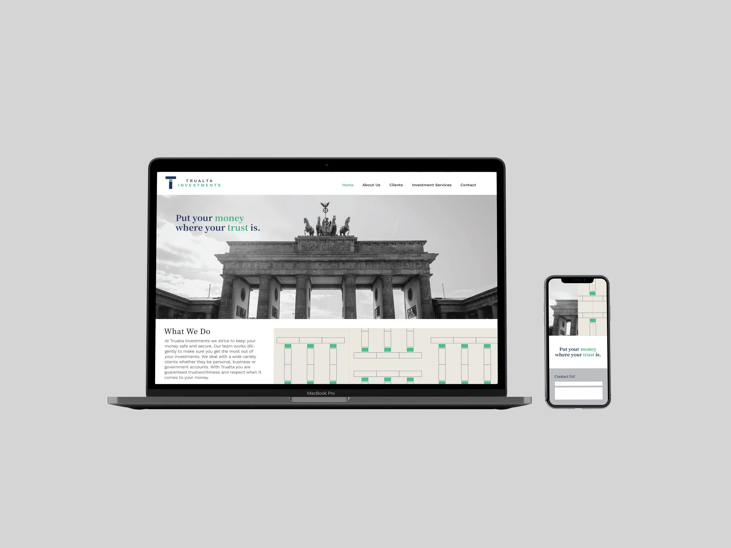
Trualta Investments is an investment company that values trust when it comes to their customers. The typographic treatment is clean, simple, and clearly recognizable as the “T” (Trualta) and “i” (Investments) in the name. It suggests confidence, balance, and strength. The typography below the logo is a spaced out, sans serif typeface contributing to the overall modern and stable look. The tagline features a serif typeface to show contrast and versatility within the brand. The logo, typography and tagline are all centered to emphasize a strong central axis and a symmetry that the brand represents.